The rules for matching a watch strap colour aren't complicated. Most of what gets written about it is either too rigid or vague enough to be useless. Here's a working framework.
Start with the dial
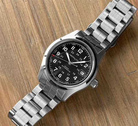
The simplest anchor for your colour choice is the watch dial. Brown and tan straps work universally because they sit neutral against almost any dial colour. Black is the most formal and pairs cleanly with darker dials. Coloured straps work best when they echo or contrast deliberately with the dial rather than clashing accidentally.
If your dial has warm tones (cream, champagne, honey), go warm with the strap. If the dial runs cool (white, silver, grey), a cooler strap colour reads more intentional.
Match to the metal, not just the dial
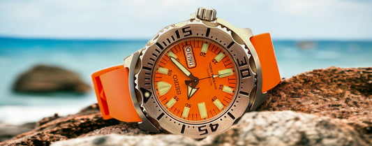
Watch case colour matters more than most people account for. Gold and rose gold hardware reads warm, so brown, tan, and burgundy straps extend that naturally. Silver and steel hardware is neutral, which means it takes colour well. A bright FKM strap on a silver-cased diver looks deliberate. The same strap on a gold dress watch looks like a mistake.
Dress code drives the decision
Casual contexts give you room to experiment. Bright colours, patterned textures like waffled rubber, or two-tone combis all work when the rest of the outfit is relaxed. For business or formal settings, pull the palette back: navy, black, chocolate brown, or olive green sit quietly without drawing attention away from the watch itself.
The useful rule: the more formal the context, the closer the strap colour should track to something neutral.
Outfit coordination (the shortcut)
You don't need to match strap to outfit exactly. Coordination is easier than matching. If you're wearing earth tones, a brown or olive strap ties it together without looking calculated. If you're in navy or grey, black or dark blue reads cleanly. Bright straps work best as a single deliberate accent, which means keeping the rest of the look simple.
When to break the rules
The rules above exist so you understand the baseline. Once you know them, you can ignore them deliberately.
A bright orange TROPICAL strap on a tool watch in a boardroom is a statement. It only works if you know the room and wear it without apologising for it. A mismatched strap that gets commented on positively isn't a mistake, it's taste.
The one pairing that rarely recovers: a light-coloured strap on a watch with accumulated patina or scratches on the case. The contrast makes the wear look accidental rather than earned.
Practical starting points
If you want a strap that works across most watches and most contexts: brown, navy, or olive green. All three sit in the middle of the formality spectrum and coordinate with more outfits than either black or bright colours.
If you want one strap that looks intentional: pick a colour that either matches your watch's dominant dial tone or sharply contrasts it. A red strap on a black-dialled diver. A grey strap on a white-dialled chronograph. The contrast makes it look chosen.